

Nauru Currency Production
Background
The Republic of Nauru, an island in the Central Pacifics, is the world’s third smallest country by population and by area. In its early days, its rich phosphate deposits and other natural resources attracted various interested parties to the island and brought wealth to the small country; at its peak, Nauru’s GDP per capita was a staggering $50,000, second only to Saudi Arabia.

Courtesy of Winston Chen | Unsplash
However, as their resources exhausted, Nauru’s economy collapsed and had to turn to the Australian government for financial support. The nation’s land was severely damaged by the mining efforts, rendering the land useless for food production. Nauruans are now left with a failing economy, a diet that is entirely reliant on imported processed goods, and a broken island that can hardly support its people.
Objective
Without a stable economic system, Nauru has not established its own currency. Therefore, this project from my Print-Based Media class aimed to imagine a time when Nauru finally launches its unique banknotes, and realize that vision with our design. The finished set of product must include three different denominations, each with the key functionalities of banknotes: intuitive information arrangement for easy identification, user-oriented design for accessibility, and anti-counterfeit measures.
Development
After extensive research, I’ve decided to center my main theme around what is realistically left of this lost paradise: their geographic status as an island. To find their way back into the global community and, once again, stand on their own two feet, Nauru would need to utilize their natural advantages and explore options like tourism to increase variety in income methods. With this direction in mind, the new currency system would serve as a symbol of moving into the future. It should reflect what they take pride in the nation, and also be able to visually leave impressions in the minds of tourists.


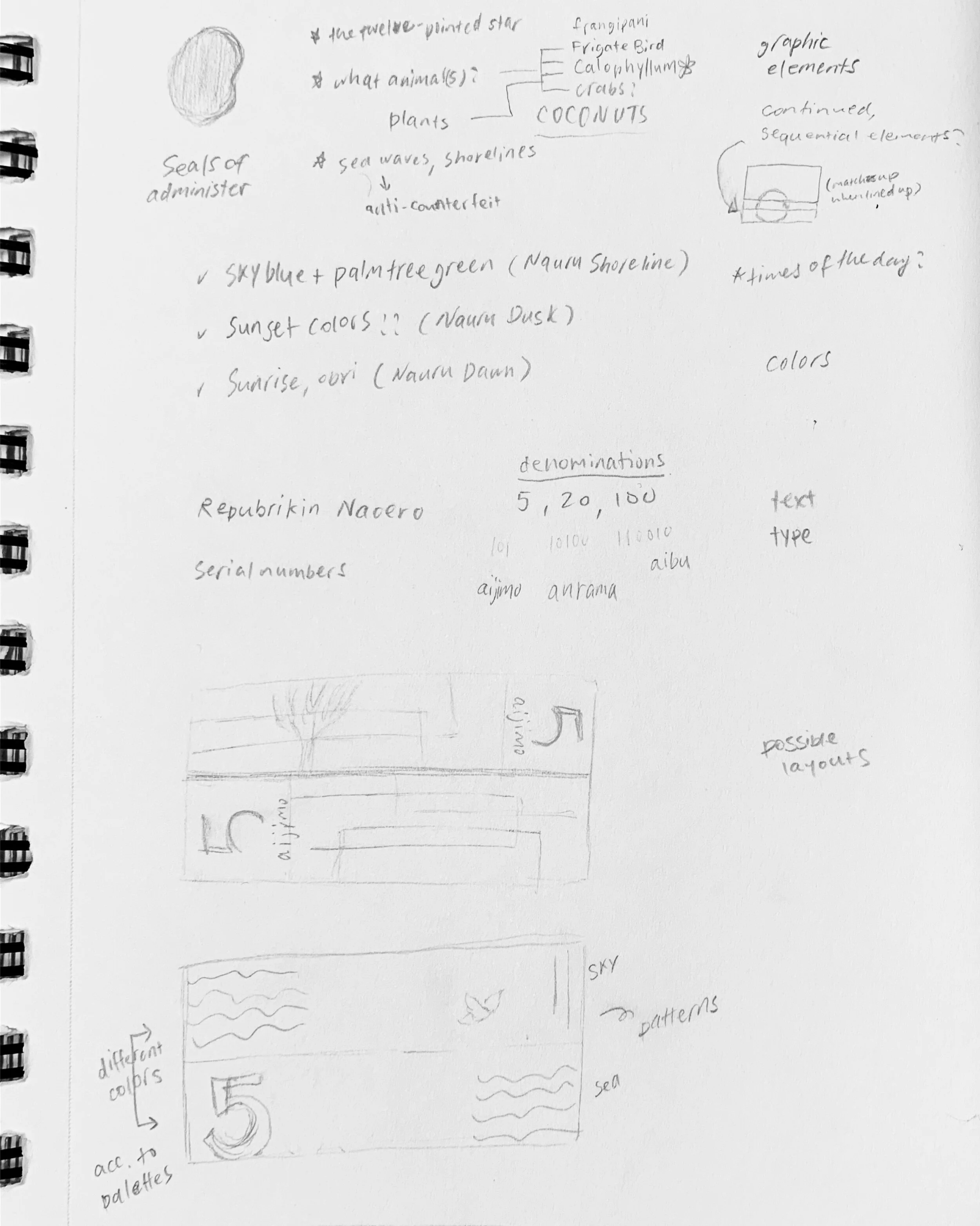
Notes from the early planning stage and sample digital comps
Natural scenic motifs were used in my designs as homage to their tropical environment. I have chosen three of the common species found on the island to represent its ecology: coconut crabs, frigate birds, and frangipanis. The fragmented, overlapping imagery is a device to emulate the hazy, perhaps even illusive feeling that experiences and memories of a place can give after visiting there, as well as Nauru’s own convoluted history and identify.
Right next to the denomination, I included the values in Nauruan, a distinct Micronesian language spoken by 96% of ethnic Nauruans. The length of each denominations are also varied in design, providing an extra measure to accessibility for all. Note that the mockups and prints produced for class were limited by resources, so many of the more intricate banknote features, such as embossing, watermarks, and others involving special printing techniques, are absent due to the difficulty of replication in a college printing lab.